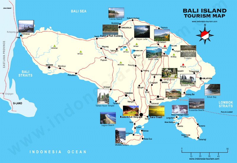
This is a tourist map of the island of Bali in Indonesia, from www. indonesia-tourism.com, this map is interesting because it shows images of several areas on the island on the map and shows where on the map these images are from.
 This map shows the distribution of the mixed race population within the city of Buffalo, NY. It is a proportional symbol and chloropleth map. The circles and color both showing the amount of mixed race people in each census tract. With darker colors and larger circles representing a larger mixed race population. There is a clear spacial pattern with large amounts of Mixed race people living in the Northwestern portion of the city especially in the area just North of downtown, and there are very few mixed race people living in the Southern portion of Buffalo. This means that the Northern portion of Buffalo is likely more racially diverse then the Southern portion.
 This is a proportional symbol map with a Conical projection showing capitol cities with populations of greater then 750,000 the size of the dot represents population, as larger dots are capitol cities within a larger population range there are 5 different dot sizes, classes within the map. This map is not quite up to date as the national boundaries are those from 1992 which is why the Ukraine and nations of Central Asia are shown as still part of Russia. The dot values are also based on population values from 1992.
 This map is a dot map showing the density of vacant homes


The first map, near the bottom, shows annual precipitation in

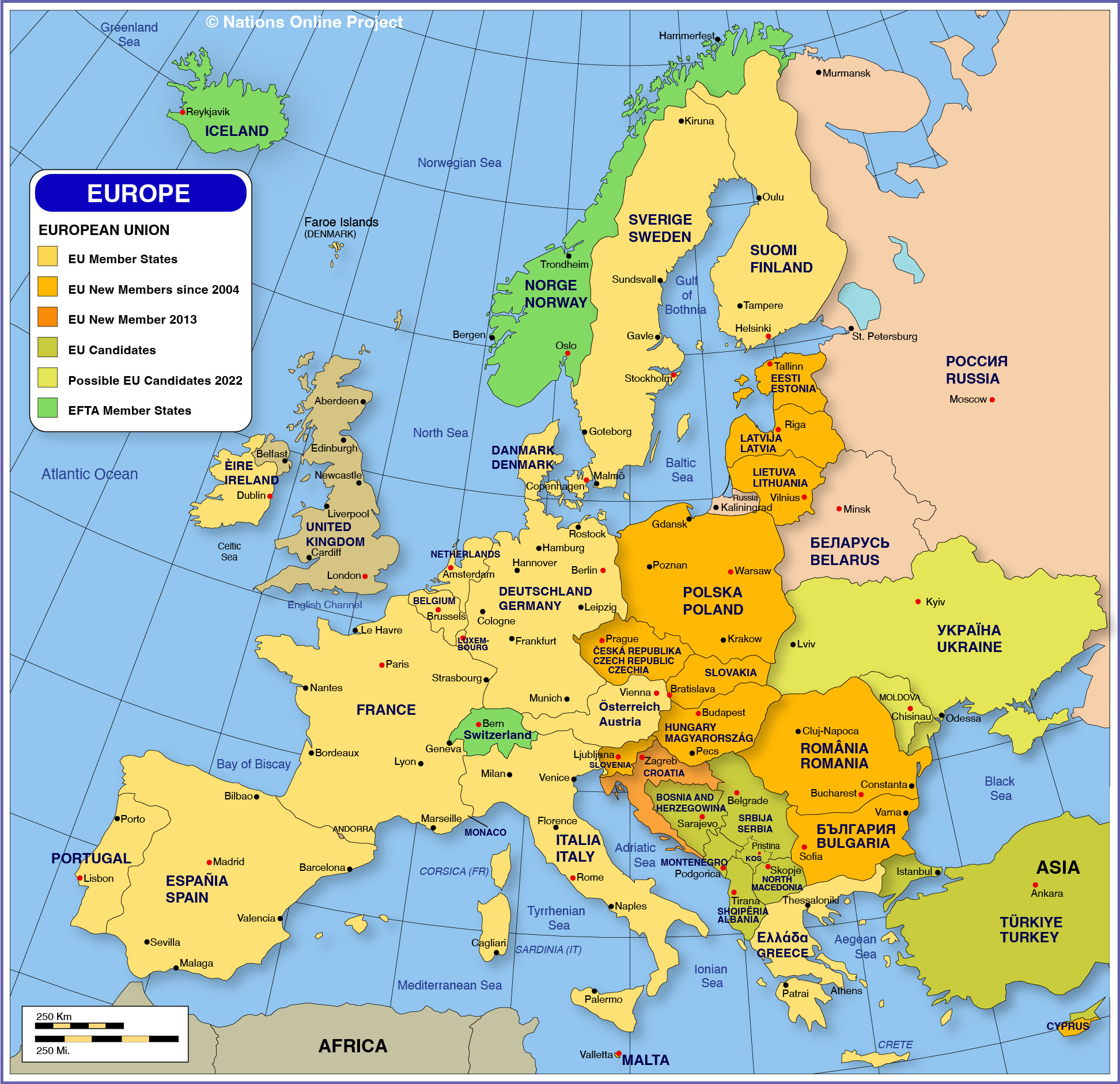
 showing EU member nations and which nations were added as members members in 2004 and 2007 it also shows EU candidate nations and EFTA member nations