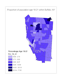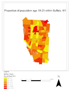

The map on the right is my original map showing the proportion of the population age 18-21 in each census tract of Buffalo, NY. The map on the left is my improved version of this map. One major change I made with the second map was the color scheme. Since the data I was using was quantitative, I used a single-hued color scheme. I also changed how the data was classed from the quantile method to the natural breaks method. I made many of the same formatting changes inn this map as I did in the previous map, for the purpose of minizating the amount of white-space.
No comments:
Post a Comment